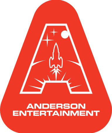
So what do you think of the new Gerry Anderson logo? We hope you like it. We love it. This week's guest blog comes from IDO's Dave Low - about his love of all things Gerry Anderson and how he came to design the logo.
'I loved Thunderbirds and Space: 1999 as a kid. They were my absolute favourites and had me glued to the TV - great stories, action, adventure and explosions. Lots of explosions! The shows were big, bold and always looked amazing.
I was hooked - and not just on Anderson shows. Anything that had a special effects element - creatures, animatronics, prosthetics, stop-motion, motion control, miniatures, props, matte painting, TV or film. I couldn't get enough. Thing is I can trace it all back to a futuristic adventure about a slender blue aircraft with a bomb in its undercarriage - saved from disaster by an ex-astronaut and his five sons.
Trapped in the Sky is a great episode - even though it does have a bit of a plot-aiding logic jump; why would you build an atomically powered passenger airplane that could stay in the air for six months but the radiation shielding is only effective for just over two hours?
That doesn't matter though, when you're a kid watching the telly after Sunday lunch. It's simple. Plane can't land. Can't stay in the air. Lives are at risk. Time is running out! Past-me was utterly transfixed!
Now, as present-me looks back, I love the fact that the Fireflash's cockpit is built into the tail of the aircraft and the pilots look out over the whole fuselage and that the first-class passenger lounge's panoramic windows form part of the leading edge of the wings. Its that inventiveness and attention to detail which is everywhere in Gerry's shows.
Everything looks or functions the way it does for a reason - the imagined technology, locations and engineering are designed and realised with love and very great skill. Watch shows like Thunderbirds and Space: 1999 now and you can see they have a visual duality and richness which comes from the fact that they are set in the future but have design cues contemporary to the time they were made.
 I feel very fortunate to have met Gerry if only just for a couple of hours. Glenn and Tim at Kindred Productions had made documentaries about him and his work and they'd set up a meeting with him to discuss a possible retrospective TV project. They asked me along for input on graphics and animation for the shows. Gerry was soft-spoken and friendly and it was fantastic to hear him talk about his creations first hand - I could have listened for ages.
Time passed and it became clear that it was unlikely the project we had discussed would come to fruition. On 27th December, a friend who knew that I had met him tweeted: "thought of you re: Gerry Anderson". I hadn't heard that Gerry had died so I went straight to the BBC News website and there it was. As Brian Blessed put it "A light has gone out in the Universe"
I got a call from Glenn in January. We talked about Gerry's funeral for a while - about the huge number of tributes to him that poured in and how fans had travelled from all over to attend. But then he went on to tell me that there were projects that Gerry was working on before he passed away that Anderson Entertainment wanted to finish and was I interested in making a teaser video for the Anderson website. On that day I was working at a client's office and I know I got a couple of funny looks as I strolled back in from taking the call the car park - grinning from ear to ear!
In my initial meeting with Jamie, the plan was just to produce the teaser video but I asked him if I could come up with a new Gerry Anderson logo - he agreed and I set to work.
We went through a number of iterations, rejecting some things, keeping others and fine-tuning - back and forth until it felt right. I wanted to create something that was bold and unmistakably Gerry Anderson. It had to look good on the website and social media as well as printed material - cards, T-shirts, merchandise and the like. I opted for flat colours and an illustrative style, giving a slightly retro look that would sit well with the legacy shows but at the same time look to the future and a new audience - to convey that a new, exciting adventure was beginning!
A few days passed while the final decision was made; I received a text message from Jamie that Anderson Entertainment wanted to use my new Gerry Anderson logo. I was delighted. Videos, icons, backgrounds, wallpaper, text, photos, branded assets for Facebook and Youtube were all produced in the days that followed and the website and social channels took shape. I was really hoping that people liked the design - so many people love Gerry's shows and I really wanted to get it right.
The response so far has been awesome!
This has been the most fun to do and I am very proud to have been able to help bring the news that new Gerry Anderson material is on its way and tell fellow fans to "Stand by for ACTION!"'
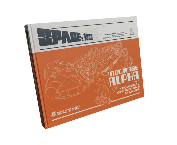


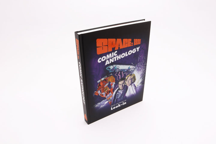
![Fireball XL5 World Space Patrol Technical Operations Manual [HARDCOVER BOOK] - The Gerry Anderson Store](http://gerryanderson.com/cdn/shop/files/fireball-xl5-world-space-patrol-technical-operations-manual-hardcover-book-290050.jpg?v=1711729272&width=720)

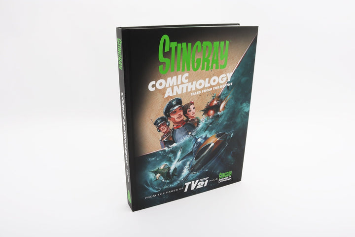

![Stingray Comic Anthology Volume Two – Battle Lines [HARDCOVER] - The Gerry Anderson Store](http://gerryanderson.com/cdn/shop/files/stingray-comic-anthology-volume-two-battle-lines-hardcover-107681.jpg?v=1738856151&width=720)
![Space: 1999 and UFO Book Bundle - Signed Limited Editions [HARDCOVER NOVELS] - The Gerry Anderson Store](http://gerryanderson.com/cdn/shop/files/space-1999-and-ufo-book-bundle-signed-limited-editions-hardcover-novels-589446.jpg?v=1718836845&width=720)
![Stingray WASP Technical Operations Manual Special Limited Edition [HARDCOVER BOOK] - The Gerry Anderson Store](http://gerryanderson.com/cdn/shop/files/stingray-wasp-technical-operations-manual-special-limited-edition-hardcover-book-991914.jpg?v=1732922875&width=720)
![Stingray: The Titanican Stratagem – Signed Limited Edition [HARDCOVER NOVEL] - The Gerry Anderson Store](http://gerryanderson.com/cdn/shop/files/stingray-the-titanican-stratagem-signed-limited-edition-hardcover-novel-129251.jpg?v=1740558711&width=720)


